Personas


Natali Levi, 24 years old, Single
Occupation:
Communication major & waitress
Objectives:
Listening to music on the way from school to work & back
Looking stylish & Up to date
Needs:
Headphones with a long-lasting battery
Stylish design
Omer Bitas, 35 years old, Married + 1
Occupation:
High-tech worker, Plays music as a hobby
Objectives:
Quieter environment at work
Listening to music
Precision audio editing
Needs:
Noise cancellation
High quality audio playback
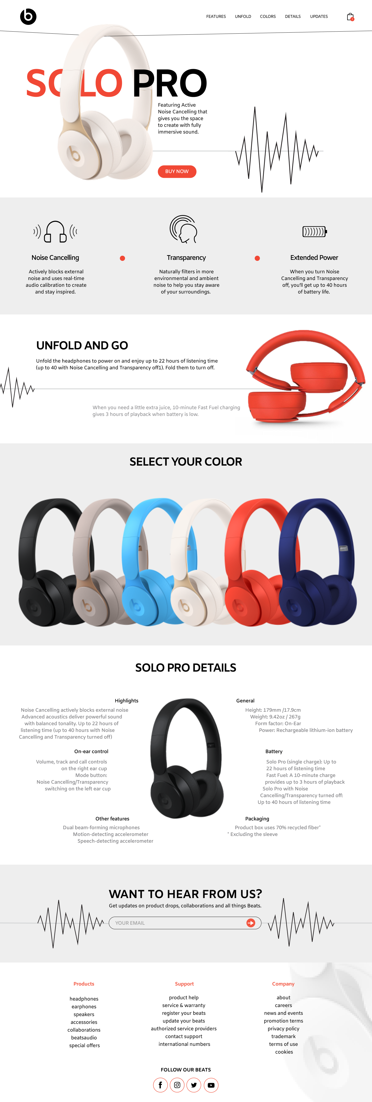
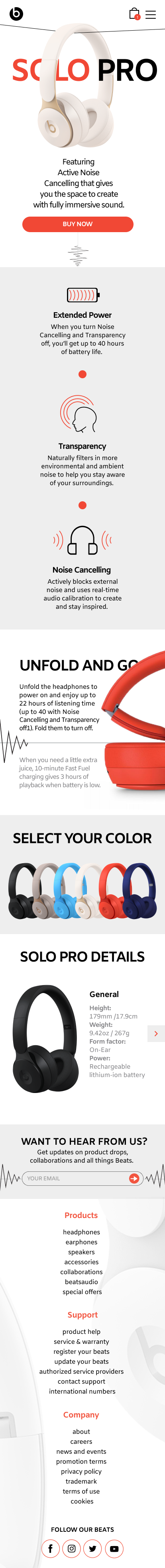
Colors
I chose to use the colors Black, White & Red – Orange as my main colors.
The bright Red – Orange is considered a very young and exciting color. While the Black and White convey modernism and sophistication. The White is a very dominant color on the page, so that the viewer will perceive a sense of prestige. This is also done to create visual clarity that helps conveying the needed information to the viewer.

Typography
After several test trials I decided to use a single font for the entire page (different weights)
The font is of the ‘Sans-Serif’ type. These type of fonts convey elegance and modernism that fits very well with the brand’s young and modern attributes .
The font is of the ‘Sans-Serif’ type. These type of fonts convey elegance and modernism that fits very well with the brand’s young and modern attributes .

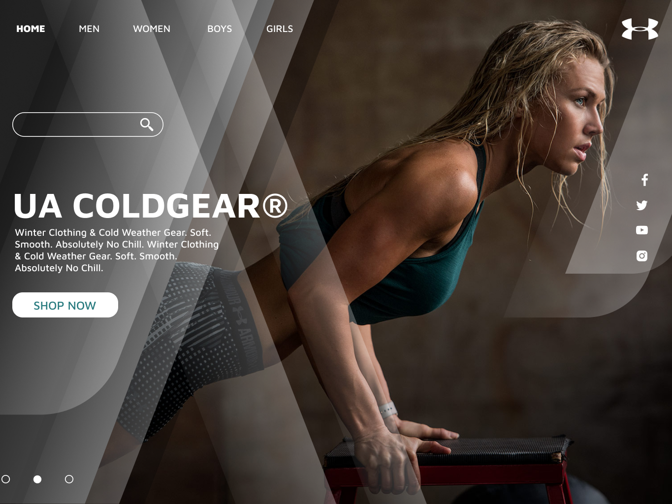
Header
For the project’s header I used a couple of the prominent gestalt principals:
Closure
I hid the brands name with the headphones. By the closure principal, although the brand name is not complete, the viewer will try and complete it with previously acquired data. Our mind can add the missing letters to create a complete image
Focal point
The area that draws most attention from the viewer is the picture of the product. From that point the viewer ‘flows’ to the other parts of the page. What creates a visual direction that drives the viewer to action.
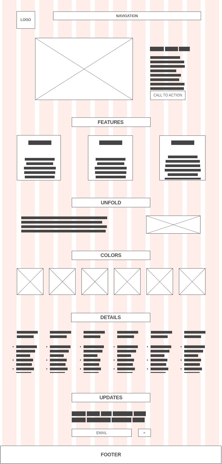
Wireframe
Final Result